
Asset Report
Last updated August 27, 2026
Asset Report
Overview
The Asset Report is a single-location performance summary. It combines transient and monthly (recurring) parking metrics, DashPages traffic, lead generation, and external factors (weather, local events, holidays) into one exportable report, plus a day-by-day Yield Calendar.
Unlike Platform Home, this report is scoped to one city/location/client at a time (selected via the filter bar) rather than showing all locations together.
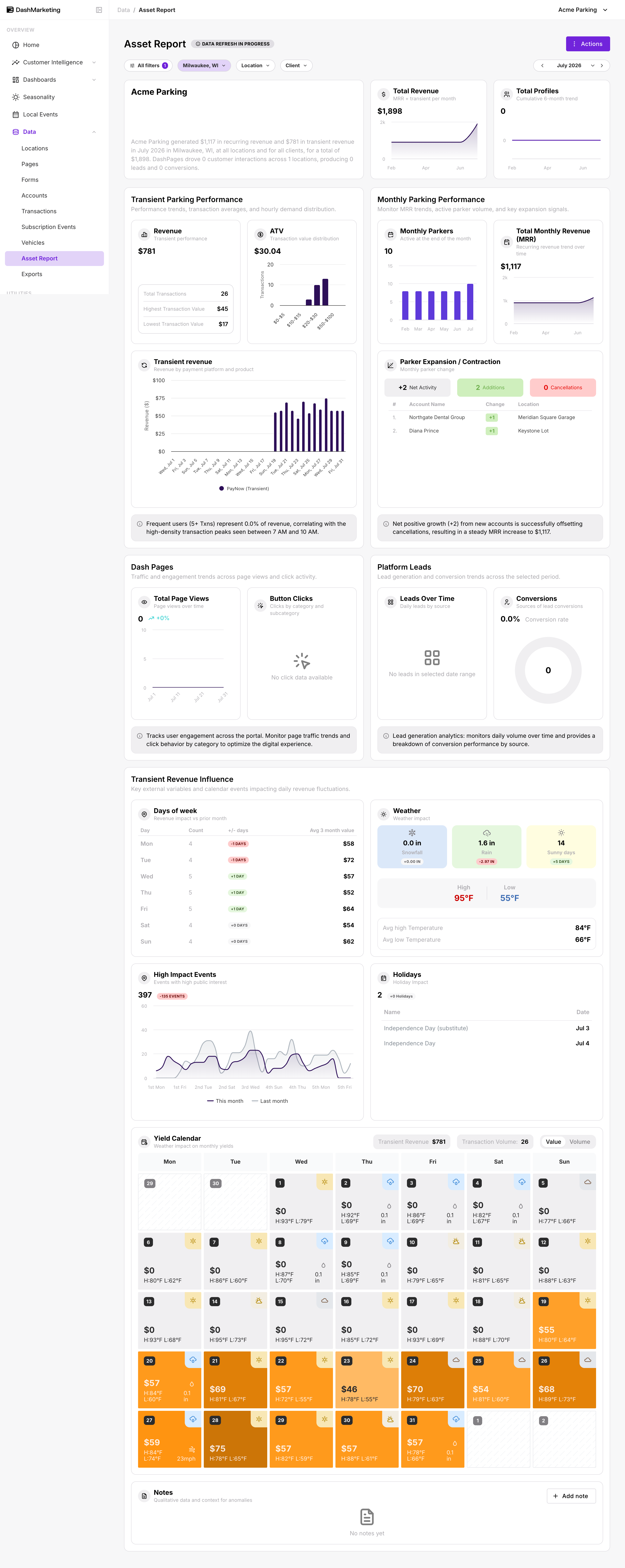
| # | Element | What it does |
|---|---|---|
| 1 | Filter bar (All filters / City / Location / Client) | Scopes the whole report to a date range, city, specific location(s), and/or client. A numbered badge on All filters shows how many filters are active. |
| 2 | Actions button | Opens a menu with Export Asset Report, which generates a downloadable report file. Export was not exercised during this walkthrough. |
| 3 | Month navigator (< July 2026 >) | Steps the reporting month backward or forward one month at a time. |
| 4 | Org summary card (logo + narrative paragraph) | Auto-generated plain-language summary of the selected period's key numbers, including recurring vs transient revenue, DashPages interactions, locations, leads, and conversions. |
| 5 | Total Revenue card | Shows combined MRR + transient revenue for the period, with a 6-month trend sparkline. |
| 6 | Total Profiles card | Shows the cumulative 6-month trend of unique customer profiles seen at the selected location/scope. |
| 7 | Transient Parking Performance panel (Revenue / ATV / Transient Revenue chart) | Shows transient-specific KPIs including revenue, transaction count, highest/lowest transaction value, average transaction value (ATV) distribution, and a revenue-by-payment-platform stacked bar chart over the month. |
| 8 | Monthly Parking Performance panel (Monthly Parkers / MRR / Parker Expansion table) | Shows recurring-parker KPIs including active parker count, MRR trend, and a ranked table of accounts with the largest parker-count changes (additions vs cancellations) for the month. |
| 9 | Insight callouts | Auto-generated one-line takeaways displayed below the Transient Revenue and Parker Expansion charts, highlighting notable performance patterns such as frequent-user revenue contribution or net parker growth. |
| 10 | Dash Pages panel (Total Page Views / Button Clicks) | Shows page-view trends over the month and a click breakdown by category/subcategory for DashPages tied to the selected location/client scope. |
| 11 | Platform Leads panel (Leads Over Time / Conversions) | Shows daily lead volume by source and a conversion-rate ring chart indicating how many leads became conversions. |
| 12 | High Impact Events chart (This month vs Last month) | Compares the count of high-public-interest local events this month vs last month, week-by-week, helping explain revenue swings associated with nearby events. |
| 13 | Holidays table | Lists observed holidays within the selected period, including their dates, alongside a Holiday Impact count badge. |
| 14 | Yield Calendar header (Transient Revenue / Transaction Volume + Value/Volume toggle) | Shows month totals for Transient Revenue and Transaction Volume. The Value / Volume toggle switches all calendar day cells between displaying dollar revenue and transaction count. |
| 15 | Yield Calendar day grid | Each day cell shows revenue or transaction volume (depending on the selected toggle), a weather icon, high/low temperature, and precipitation. Cell shading forms a heat map of daily performance across the month. |
Was this page helpful?