
Platform Home
Last updated August 27, 2026
Overview: The Platform Home dashboard (/dashboard) is the default landing page after login. It summarizes revenue and customer performance across all locations for a selected date range, with quick links into deeper reports (Transients, Monthlies, Seasonality, Local Events, Pages, Leads).
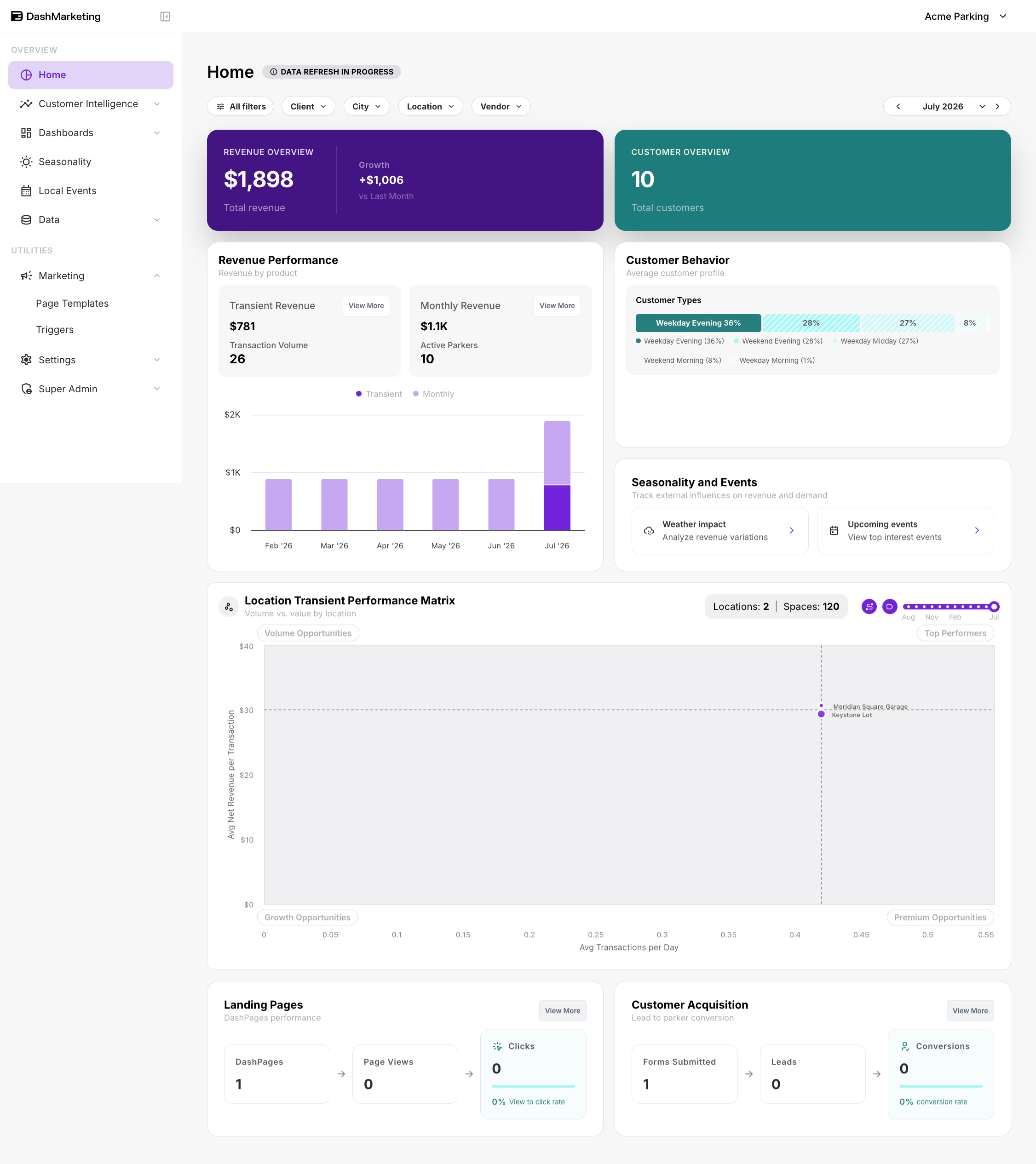
| # | Element | What it does |
|---|---|---|
| 1 | Left sidebar nav | Navigates between Platform, Asset Report, Dashboards (Transients / Monthlies / Leads / Pages / Parkers), Data, Local Events, and Seasonality. |
| 2 | “All filters” button | Opens a right slide-out panel consolidating Dates, Client, Vendor, City, and Location filters, with Clear all / Apply Filters buttons. |
| 3 | Client / City / Location / Vendor pills | Individual quick-filter dropdowns, each with a search box and checklist of available values. For example, Location lists every property by address. |
| 4 | Month navigator (< July 2026 >) | Arrows step one month at a time. Clicking the center month/year label opens a Jan–Dec grid picker for quickly jumping to another month in the year. |
| 5 | Revenue Overview card (purple) | Displays total revenue for the selected filters/date range plus Growth vs Last Month. Not clickable; summary metric only. |
| 6 | Customer Overview card (teal) | Displays total customer count for the selected filters/date range. Not clickable; summary metric only. |
| 7 | Revenue Performance panel (Transient Revenue / Monthly Revenue) | Shows Transient Revenue and Monthly Revenue totals with a 6-month stacked bar chart. Each View More link jumps to the corresponding deep-dive dashboard (Transients or Monthlies). |
| 8 | Customer Behavior panel | Breaks down the average customer profile into Frequency (Single use vs Occasional), Revenue (Low vs Emerging), and Customer Types (Weekday Midday, Commuter, Weekday/Weekend Evening, Weekday/Weekend Morning). Read-only bars; not interactive. |
| 9 | Seasonality and Events panel | Two shortcut tiles: Weather impact links to the Seasonality dashboard; Upcoming events links to the Local Events dashboard. |
| 10 | Location Transient Performance Matrix (scatter chart) | Plots every location as a dot: Avg Transactions per Day (x-axis) vs Avg Net Revenue per Transaction (y-axis). Dot size appears to correlate with space count. |
| 11 | Quadrant labels (Volume Opportunities / Top Performers / Growth Opportunities / Premium Opportunities) | Static badges naming each quadrant of the scatter chart based on high/low transactions and high/low revenue per transaction. Not clickable or interactive. |
| 12 | Locations / Spaces counter | Displays the number of locations and total parking spaces represented in the matrix, e.g. Locations: 47 / Spaces: 8,915. |
| 13 | Timeline slider + 2 small icon buttons (Aug–Jul range) | Slider scrubs/restricts the date range plotted on the chart. The two adjacent icon buttons had no observable effect during testing; their function remains an open question, rather than a confirmed bug. |
| 14 | Landing Pages card | Shows DashPages count, Page Views, and Clicks, including a view-to-click rate. View More jumps to the Pages dashboard. |
| 15 | Customer Acquisition card | Shows Forms Submitted, Leads, and Conversions, including a conversion rate. View More jumps to the Leads dashboard. |
Was this page helpful?